Fandango Movie: UX Case Study
Fandango Movie is an app where you can explore movies, check movie times and purchase tickets. I'm a movie fanatic, so I decided to delve into this app to see if there was any way I could improve the iOS experience.
Note: I am not affiliated with Fandango. This case study was for learning purposes only.
Talking to users
While using the app I encountered some frustrations and wanted to find out if other people would encounter the same problems as I did. To begin the process, I crafted three scenarios to test my hunches with real users.
I conducted guerilla usability testing at Yerba Buena gardens during lunch time. I wanted to catch people at a time and place where they would be more willing to participate (and couldn't walk away from me). There is also a movie theatre close-by, so the possibility of encountering people who fit the typical user profile was very likely.
I successfully tested with 5 people:
3/5 people had used the app before
4/5 people had watched a movie in a theatre within the last week
I grouped my insights by similarities on an affinity map to see what common issues kept coming up for users.
The affinity map shows that most users had issues with editing location and not utilizing the “Go Now” feature.
I created a 2x2 matrix and made assumptions about which problems would be important to the business and the user. This helped me decide which pain points to prioritize.
Based on my results, I decided to focus on the pain points related to the location edit function.
Here are quotes from users to emphasize why I chose this problem to solve:
“Where can I edit my location? Where is it?”
“Hmmmm, it doesn’t look like I can change anything here.”
“I’m wondering why nothing is happening when I type in San Jose.”
“At this point, I would just exit the app and Google it.”
I created a persona of a typical movie goer who also reflects the characteristics of the people I tested. I will keep Jane's needs and goals in mind when coming up with solutions.
Problems & Solutions
The pain points I will solve are mapped out below.
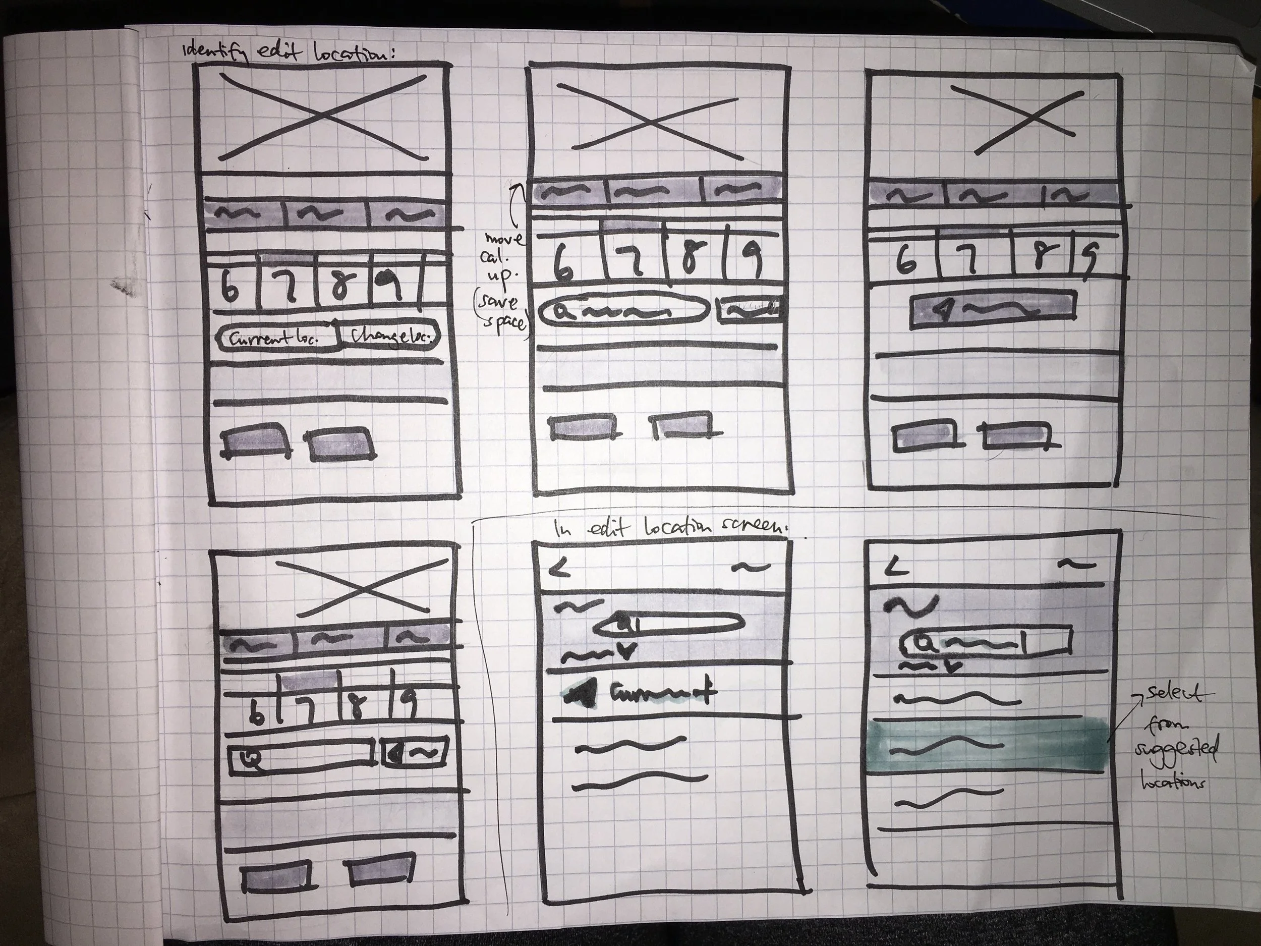
I sketched out ideas to explore possible solutions. This way, I was able to quickly get feedback from fellow designers before investing a lot of time developing an idea in Sketch.
Prototype & Validation
I picked my strongest ideas based on feedback I received from peers and translated my wireframes into hi-fi mockups to reflect my changes.
Here is a clickable prototype of my final redesign:
(Hint: My testing scenario included going to watch "Kong" in San Jose, CA)
Conclusion
This exercise taught me how important it is to put your product in front of users. I learned how differently people can tackle the same task and the varying degrees of patience people have when they get frustrated. The pain points I uncovered and solved reveal that they are design updates Fandango could implement to increase usability and to make the experience of using the app better. It also made me appreciate that even small design changes can make a big difference in the user experience, especially if it's related to a core task.


